Data Visualization in R
Data Visualization in R using ggplot2
Data visualization is an important step in data analysis. It helps us to understand patterns, trends, and relationships in the data.
In R, one of the most popular packages for visualization is ggplot2. It is based on the Grammar of Graphics, which builds plots by layering components
such as data, aesthetics, and geoms. To use this package in R, we will first need to install it if it is not already installed and then load the library to use it the functions available within the package.
install.packages("ggplot2") # Install ggplot2 if not already installed
library(ggplot2) # Load the library
We’ll use the mtcars dataset which contains data on fuel consumption and car design. Then, we can plot mpg (miles per gallon) against hp (horsepower).
head(mtcars)
ggplot(data = mtcars, aes(x = hp, y = mpg)) +
  geom_point(color = "blue", size = 3) +
  labs(title = "Scatter Plot of Horsepower vs. MPG",
       x = "Horsepower",
       y = "Miles per Gallon") +
  theme_minimal()
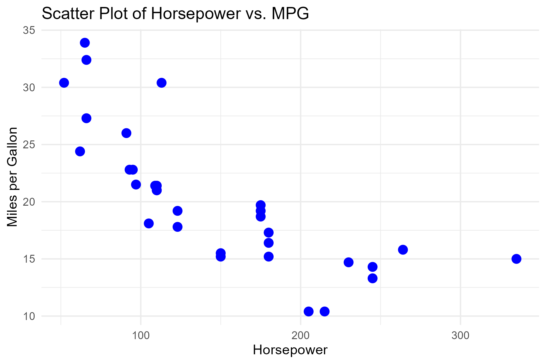
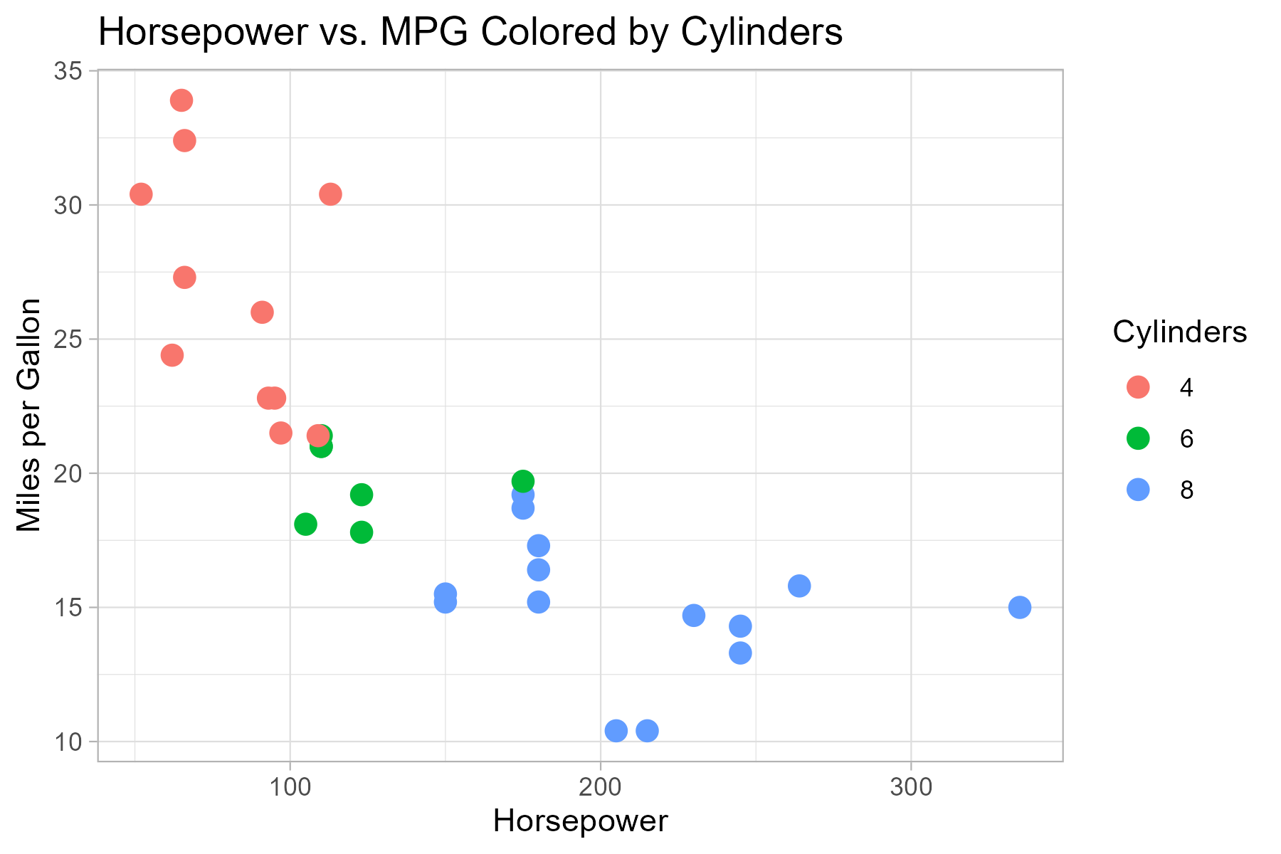
The plot output shows that cars with higher horsepower tend to have lower fuel efficiency (mpg). We can add more embelishment to several components of the plot but for this short tutorial, we will only learn how to add color by group.
ggplot(mtcars, aes(x = hp, y = mpg, color = factor(cyl))) +
  geom_point(size = 3) +
  labs(title = "Horsepower vs. MPG Colored by Cylinders",
       color = "Cylinders", x = "Horsepower", y = "Miles per Gallon") +
  theme_light()
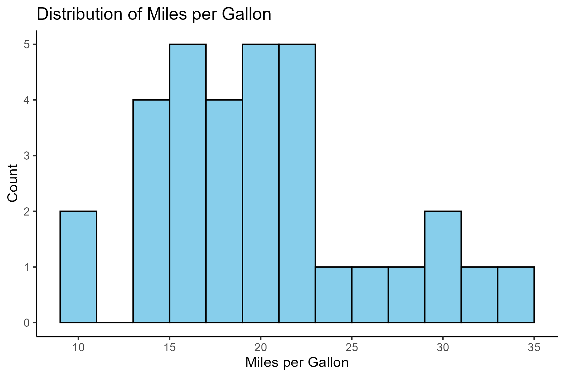
ggplot(mtcars, aes(x = mpg)) +
  geom_histogram(binwidth = 2, fill = "skyblue", color = "black") +
  labs(title = "Distribution of Miles per Gallon",
       x = "Miles per Gallon",
       y = "Count") +
  theme_classic()
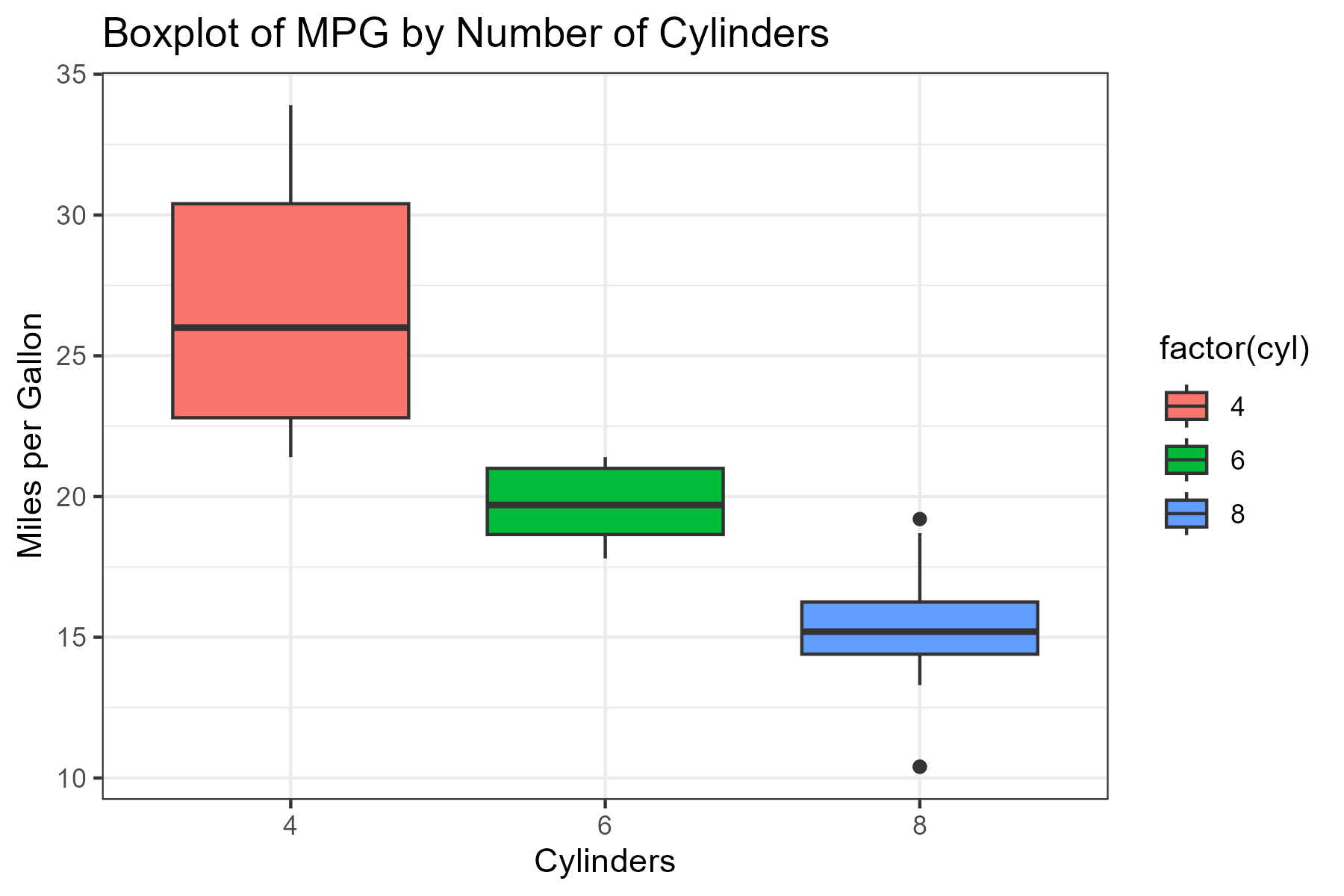
ggplot(mtcars, aes(x = factor(cyl), y = mpg, fill = factor(cyl))) +
  geom_boxplot() +
  labs(title = "Boxplot of MPG by Number of Cylinders",
       x = "Cylinders",
       y = "Miles per Gallon") +
  theme_bw()
In case you want to download the dataset used for this tutorial which is also readily available in base r, use the button below:
To also learn more on data visualization using R, check out these websites.